Information Architecture & UX Research
A complete restructuring of the Los Angeles Court website's information architecture to help millions of users find essential services without confusion.
Navigating the Los Angeles Court website can feel like a case study in confusion. For most users, whether paying a parking ticket, searching for court forms, or checking case information, the site's outdated structure, inconsistent labeling, and overwhelming navigation make even simple tasks unnecessarily difficult.
Users were frustrated by:
The goal was to rebuild the website's information architecture from the ground up, transforming it into a clear, intuitive platform that helps users quickly find what they need without frustration or guesswork.
Card Sorting, Tree Testing, First Click Testing, UI Redesign
Lead UX Researcher / UI Designer
Optimal Workshop and Figma
Summer 2024
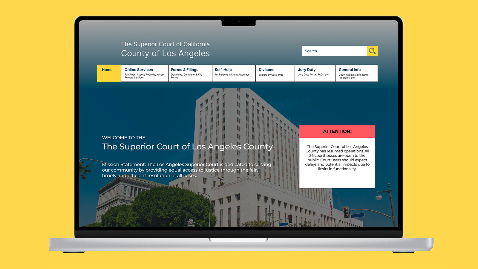
The Los Angeles Court website serves millions of users annually, but its information architecture was fragmented, inconsistent, and deeply unintuitive. I conducted extensive research using Optimal Workshop to identify navigation breakdowns, confusing labels, and organizational gaps.
I tested the information architecture through:
Identifying core usability issues
Understanding mental models
Measuring structure clarity
Validating navigation paths
Informing redesign strategy
Across more than 40 tests, several clear structural patterns emerged:
These findings validated that the problem wasn't just visual. It was structural.
We reviewed public service websites from neighboring counties, including San Diego County and Sacramento County to identify best practices in clarity and hierarchy. Compared to these, the LA Court website:
This research provided the foundation for our restructuring approach, prioritizing task-based navigation and plain-language labeling.
| Feature | LA Court (Old) | San Diego County | Sacramento County |
|---|---|---|---|
| Navigation Depth | 5-7 clicks | 3-4 clicks | 3-4 clicks |
| Global Search | ❌ | ✅ | ✅ |
| Visual Hierarchy | Poor | Clear | Clear |
| Content Layout | Text-heavy | Balanced | Balanced |
| Menu Organization | Redundant categories | Consolidated | Consolidated |
Studies on government usability consistently highlighted the importance of clear information architecture and progressive disclosure:
These findings underscored our central challenge: to make the court's digital experience as transparent, intuitive, and trustworthy as its mission.
Through more than 40 user tests and task-based studies, three distinct user groups emerged. Each with different goals but one shared frustration: navigating the LA Court website felt confusing and intimidating. Users consistently expressed a desire for clarity and reassurance. They wanted the website to function less like a bureaucratic maze and more like a straightforward, trustworthy public resource.

The Everyday Resident
"I just want to pay my ticket! Why are there five pages that say 'Traffic'?"

The Legal Professional
"I use this site all the time, but it takes too many clicks to find basic forms."

The Court Staff Member
"Half the calls I get could be avoided if people could find the right page."
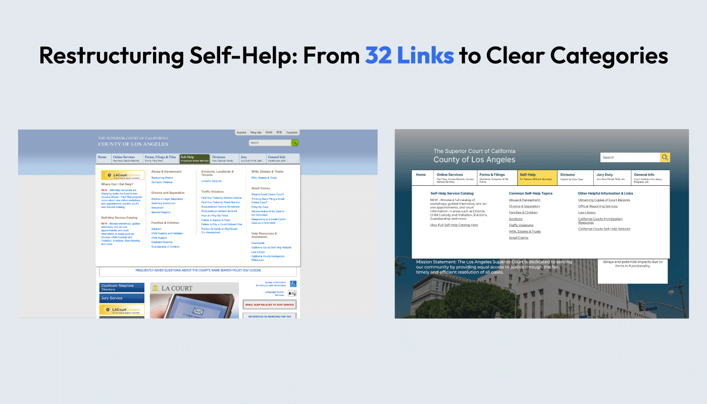
Our focus shifted toward simplifying the site's information architecture while preserving the required accuracy and legal clarity. The existing structure contained over 120 pages with redundant content and deep hierarchies that buried essential actions under 5–7 clicks. Our early exploration focused on reducing complexity and aligning labels with real user behavior.
Using open and closed card sorting with 4 participants, we explored how users intuitively grouped 51 types of content.
Key Findings:
These insights shaped our revised site structure, emphasizing user-centered grouping over departmental divisions.
We conducted Tree Testing with 8 participants to evaluate task success, directness, and average time-to-completion.
Participants cited ambiguous categories and too many nested links as recurring pain points. These results reinforced the need to flatten the hierarchy and use clearer, action-oriented language.
A smaller stress test confirmed widespread hierarchy confusion and disorientation, with less than half of users able to explain a page's relationship to the overall site structure.
Our first click test (9 participants) confirmed that critical tasks were either mislabeled or buried, leading users to guess rather than navigate with confidence.
| Task | Success Rate | Avg. Time (sec) |
|---|---|---|
| Pay a Ticket | 91% | 12.0 |
| Jury Duty Info | 100% | 8.1 |
| Find Courthouse | 100% | 12.8 |
| File Restraining Order | 0% | 12.8 |
| Schedule Remote Appearance | 67% | 19.9 |
By combining insights from all tests, we established the main principles guiding our redesign:
These principles guided the next phase of our work: building and validating the redesigned information architecture.
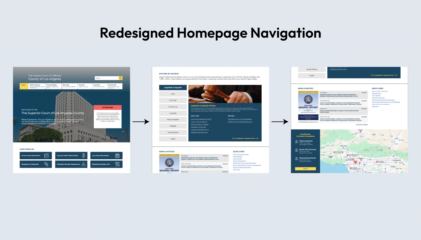
The new IA prioritized plain-language labels, fewer menu layers, and task-based organization. The original site had over 120 pages and six overlapping categories. We consolidated this into five clear navigation areas:
This simplified structure ensured every task could be completed within three clicks or fewer.
The visual direction focused on clarity, consistency, and accessibility. Key design decisions included:
These changes supported both usability and trust, critical qualities for a public institution.
We conducted a second round of testing through redesigned Tree Tests and First-Click Tests.
The restructured hierarchy led to measurable improvements in speed and success rates:
| Task | Old Success Rate | New Success Rate | Average Time (sec) |
|---|---|---|---|
| Pay a Ticket | 91% | 100% | 3.3 |
| Jury Duty Info | 100% | 100% | 4.9 |
| Schedule Remote Appearance | 67% | 100% | 4.6 |
| Interpreter Services | 100% | 100% | 4.0 |
| File Restraining Order | 0% | 71% | 13.7 |
These improvements demonstrated that clearer labeling and restructured hierarchy directly improved navigation success and reduced decision time.
The redesigned information architecture and labeling system resulted in:
The redesigned LA Court website focuses on clarity, trust, and accessibility. By overhauling the site's information architecture and simplifying its language, I created a structure that allows users to confidently complete their goals without unnecessary complexity. Every decision was informed by real user behavior—ensuring the final information architecture reflected the way people actually think.
These results demonstrate how a clear structure and intentional design language can transform a user's experience, particularly where confusion can have serious consequences.
The new IA and structure were integrated into an interactive prototype. Key highlights include:
What stood out most working on this project was how much the problem was structural, not visual. The research kept pointing back to the same thing: people weren't lost because the site looked bad, they were lost because no one had organized it around how users actually think. That realization shaped every decision from card sorting through the final prototype.